Running an A/B test
How to use NannyML to run an A/B test.
NannyML allows you to run A/B tests for binomial variables.
Using our prepared dataset.
We have prepared an A/B testing dataset from Kaggle. You can see the details about the dataset and the preparation here.
Adding a new experiment to NannyML Cloud
The Add New Experiment button initiates the wizard that guides you through adding a new experiment.
Note that NannyML has three main hubs: the Monitoring Hub, the Model Evaluation Hub, and the Experiment Hub. Each hub customizes the Add button. When viewing the Experiment hub, the "Add new experiment" button will appear.
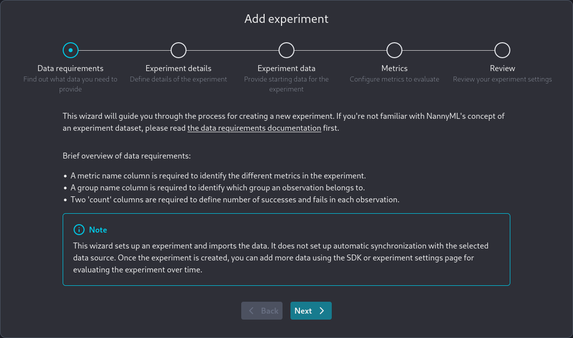
The wizard's first screen shows some basic information needed to add an experiment.
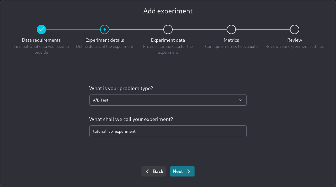
In the next screen, you specify some important information about the experiment you are adding:
You need to specify:
The type of test you are performing. Currently, only A/B tests are supported.
The name of your experiment.
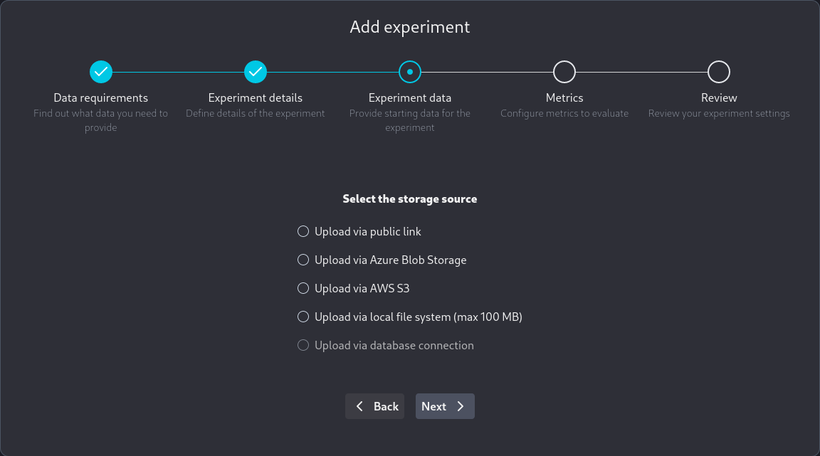
In the next screen, you are asked about specifying how you will provide your experiment data.
We recommend using parquet files when uploading data using the user interface.
NannyML Cloud supports both parquet and CSV files, but CSV files don't store data type information. CSV files may cause incorrect data types to be inferred. If you later add more data to the experiment using the SDK or using parquet format, a data type conflict may occur.
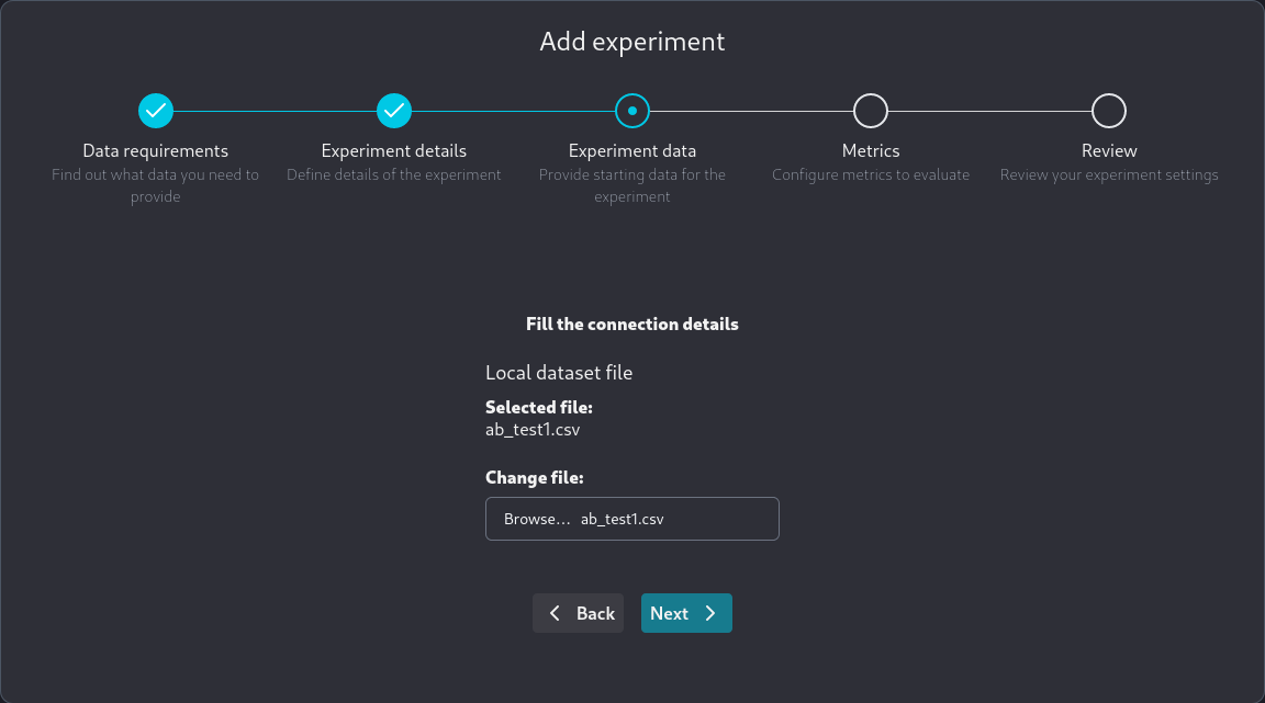
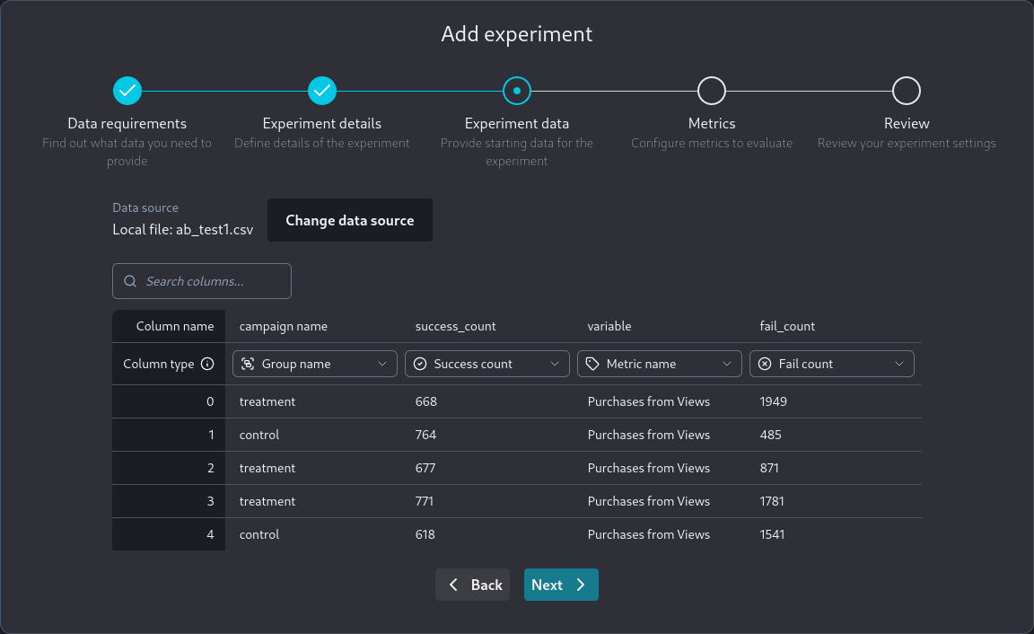
There are four options for adding new data—a public link, a local upload, and AWS S3 or Azure Blob storage. We use the local upload for the synthetic file we created, and we get a confirmation screen:
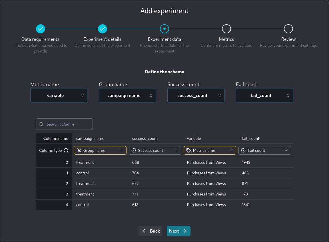
After providing your data, you need to specify what it contains, as seen below.
After providing the data we are again presented with a screen showing our choices for review.
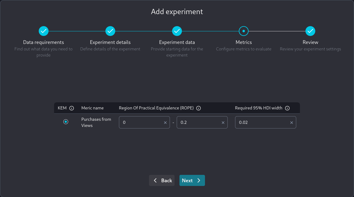
We are then presented with the Metrics screen. All metrics we have submitted on the experiment data will be present here. In our example there is only one metric.
We have to specify two things:
The Region of Practical Equivalence for the differences in posterior probability densities.
The required 95% HDI width before we can decide on the experiment's result.
Let's expand on what we mean by the Region of Practical Equivalence for the differences in posterior probability densities. NannyML calculates the Bayesian posterior for the metric of interest for both the control and experiment data. Then, it calculates their difference. The region of practical equivalence is where we expect that difference to be in order for our A/B experiment to succeed.
As mentioned, NannyML calculates the difference between treatment and control of the posteriors. This difference itself is a posterior. The 95% Highest Density Interval (HDI) is then calculated as the area that contains the most probable 95% mass of the posterior probability density. The difference between the minimum and maximum of this area is called 95% HDI width. The smaller the 95% HDI width the more confident we are in the metric we are measuring, hence as our experiment progresses the 95% HDI width will be decreasing. The required 95% HDI width is the value we want 95% HDI width to reach before we can decide on the success or failure of the A/B experiment.
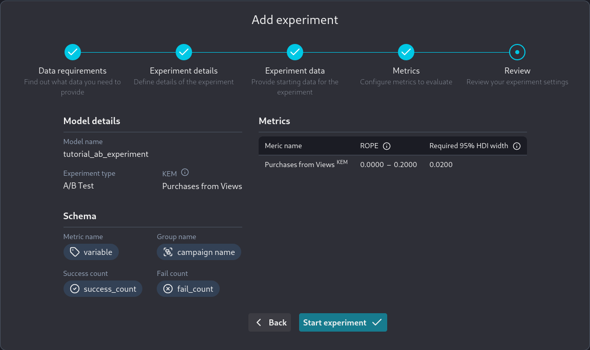
Finally, we have the review screen where we can review all the parameters we have specified regarding the new experiment:
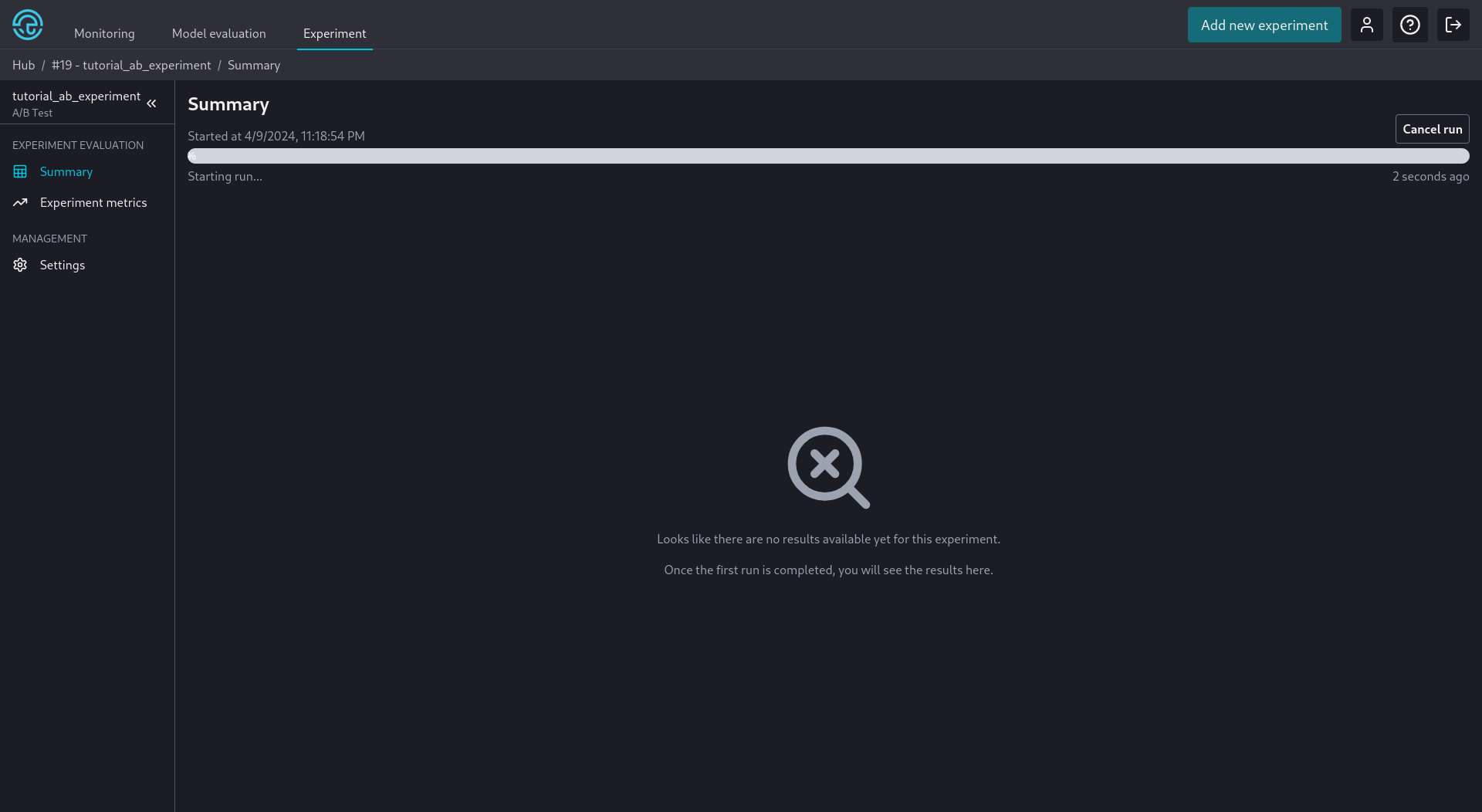
The application then goes to the experiment summary screen. If a run has not automatically started we can manually initiate it.
Adding more data
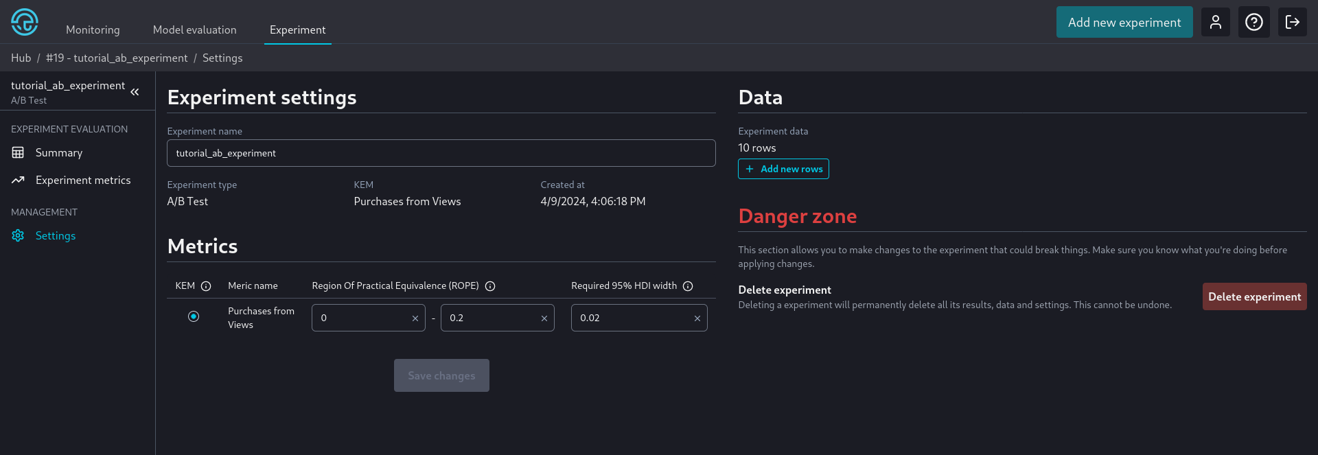
We often don't have all the data needed to conclude the experiment results immediately. We can add more data from the model settings screen when more data becomes available later.
At this screen, we can also review the settings we chose during the experiment creation wizard and make any necessary changes.
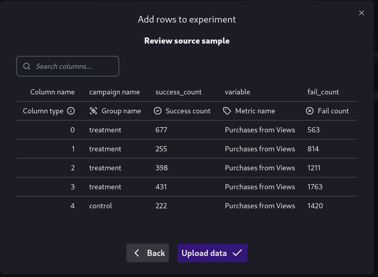
After we add more data, through a process similar to the one we used during the add new experiment wizard, we are again presented with a confirmation screen.
Viewing Results
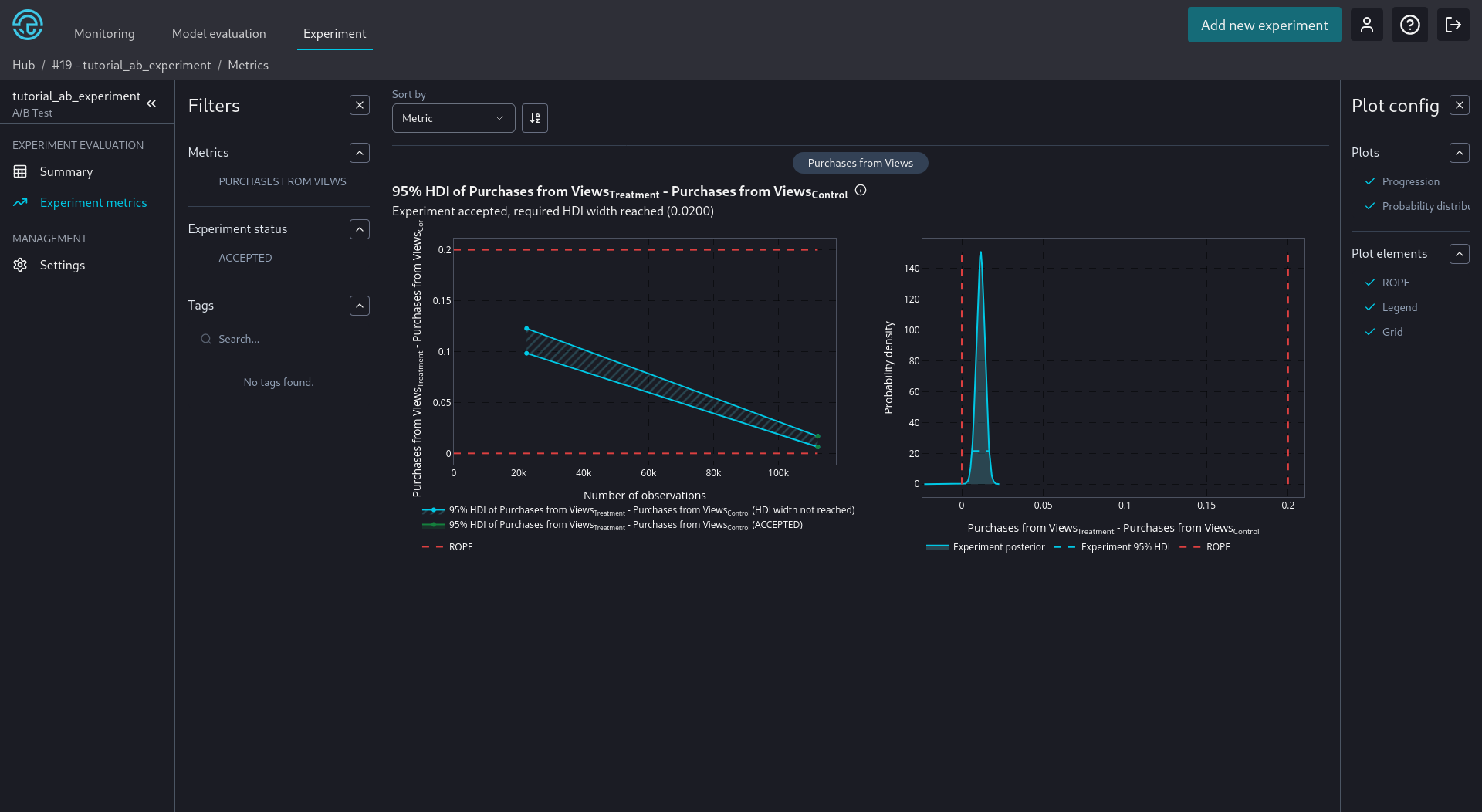
After we have added all available data and NannyML Cloud has finished processing them, we can view the results of our experiment. They are present in the Experiment metrics tab. We can see an example below:
The experimental results for each metric are presented with two plots.
On the left, we see the evolution of the 95% HDI of the differences of the posteriors of the experiment metric as we add more observations. The limits of the ROPE are shown as horizontal red dashed lines. The HDI is colored differently according to the status of the experiment. It starts with light blue color and will stay so until the required 95% HDI width is reached. After the required 95% HDI width is reached it will again stay light blue until the 95% HDI width is either fully inside or fully outside the ROPE region. If it is fully outside it will become red colored and the experiment will be rejected. If it is fully inside it will become green and the experiment will be accepted. The fill between the lines showing the edge of the 95% HDI is also governed by the status the experiment had on the previous point. (This is why the fill on the image above is light blue but the status of the experiment at the end of the points is green - accepted.)
On the right side, we see the posterior of the difference between the treatment and control groups. Again, the ROPE limits are shown as vertical red dash lines.