Covariate shift
The covariate shift dashboard enables visualization of drift in all features (multivariate) and in a single feature, using six drift detection tests. If you prefer a video walkthrough, here is our guide explaining how to use the covariate shift page:
Here, you can find detailed descriptions of various elements on the covariate shift page:
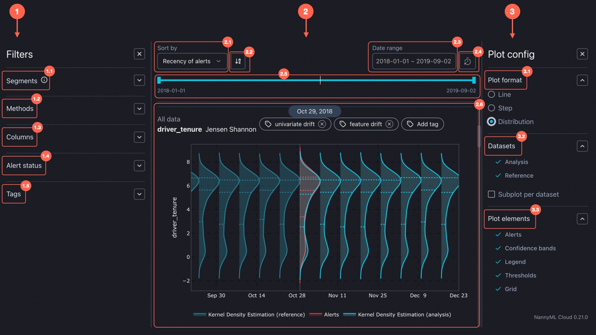
The Covariate shift dashboard consists of three main components:
1. Filters
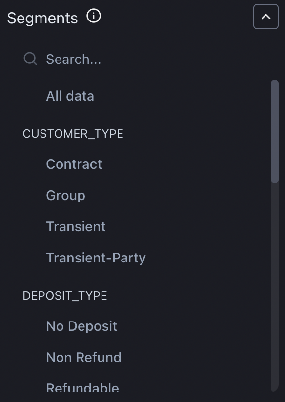
Segmentation allows you to split your data into groups and analyze them separately.
For a given model, each of the columns that are selected for segmentation during configuration or in the model settings appears under the segmentation filter. Segments are then created for each of the distinct values within that column.
In the filter section, you can select the segments you want to see visualized. You can also select All data to visualize results for the entire dataset.
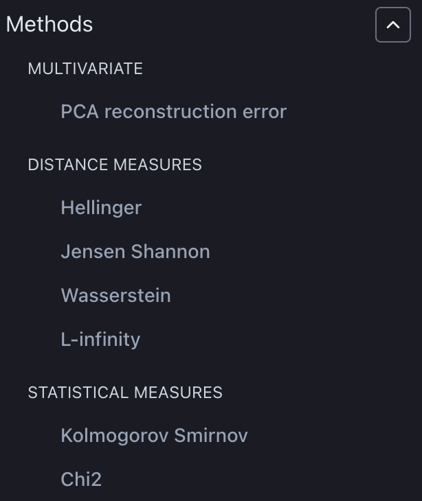
Select which drift methods you want to have results displayed for. Drift methods that are not calculated are not visible under the filter. Selecting which drift measures you want to have calculated can be done under model settings.
Please find more info about statistical and distance measures in the NannyML Open Source documentation.
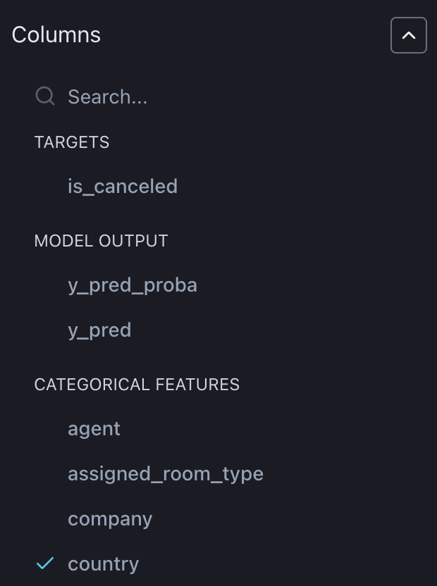
Filter charts for the columns you want to see. NannyML automatically identifies feature types such as targets, model outputs, and continuous and categorical features, making it easier for you to find the relevant ones.
Note that the univariate drift detection methods can also be applied to the model output and the target, not just the features.
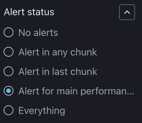
Select which drift measures to display depending on whether there are alerts in the last chunk, alerts in the previous chunks, or no alerts at all, or include all charts regardless of when and if any alerts occurred.
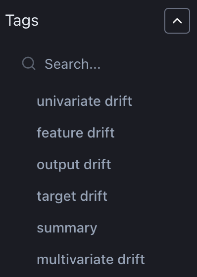
Filter charts by the previously specified tags.
2. Visualisations
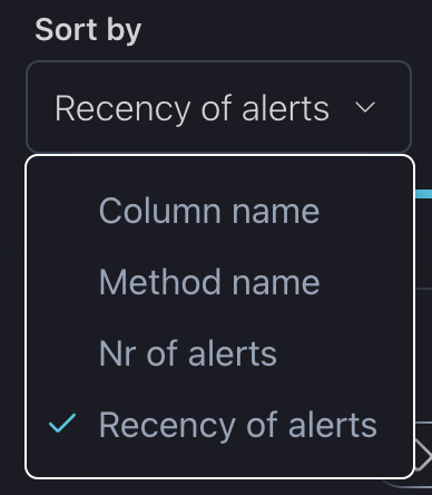
You can change the order of charts based on the metric name, number, or recency of the alerts.
For all sorting methods, the icons shown below toggle between ascending and descending order. The icon displayed depends on the selected sorting method.
Column Name and Method Name: The icon toggles between alphabetical order and reverse alphabetical order. The default mode is alphabetical order.
Nr of Alerts: The icon toggles between ascending and descending order based on the number of alerts. The default mode displays plots with the most alerts first.
Recency of Alerts: The icon toggles between showing newer alerts first and older alerts first. The default mode shows the most recent alerts first.
You can select a specific period of interest which applies to all charts.
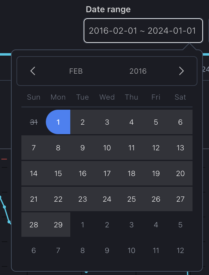
To reset a previously set date period, whether using the date range or slider, simply press the "Reset" button.
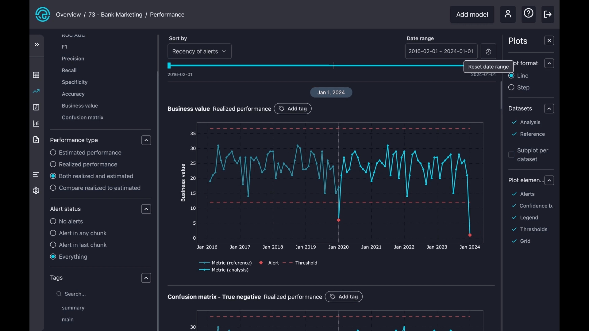
Similar to selecting a date range, you can choose a specific period of interest by simply moving the date slider.

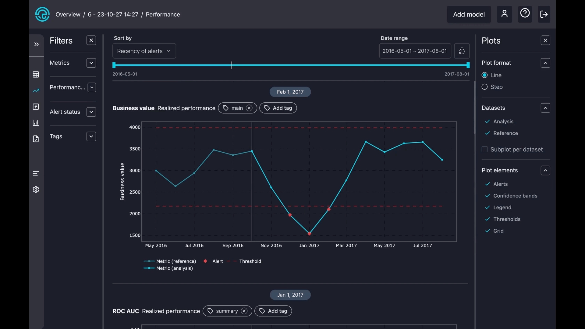
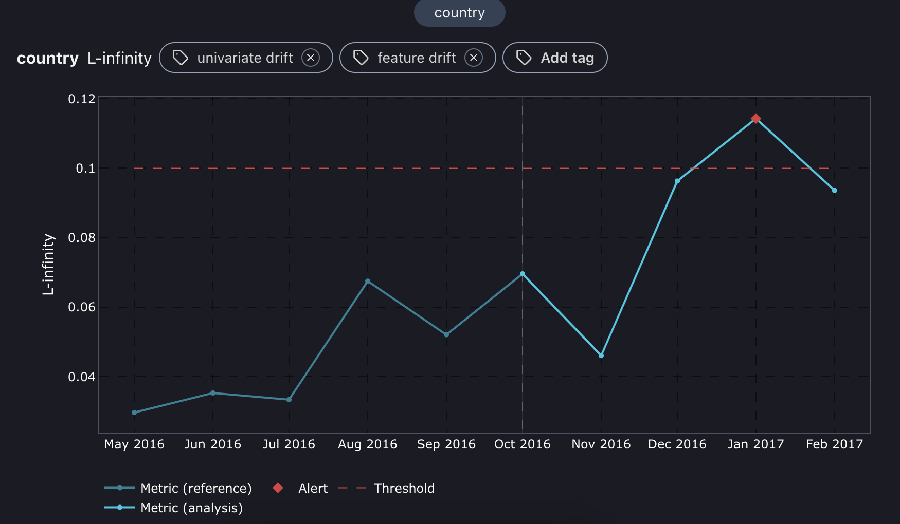
The charts are interactive, allowing you to hover over them for more details. Red dotted lines indicate the thresholds, while the blue line shows the metric during the reference period. The light blue line represents the metric during the analysis period.
You can also zoom in on any part of a chart. Simply press and hold your mouse button, then draw a square over your area of interest. To reset the zoom, just double-click on the chart.
3. Plot config
There are three types of plot formats: line, step, and distribution. A line plot smoothly connects points with straight lines to show trends, while a step plot uses sharp vertical and horizontal lines to show exact changes between points clearly. The distribution plot gives you more insights into how feature distribution has changed over time.

Select datasets to zoom in on reference, analysis, or create a separate subplot for both.
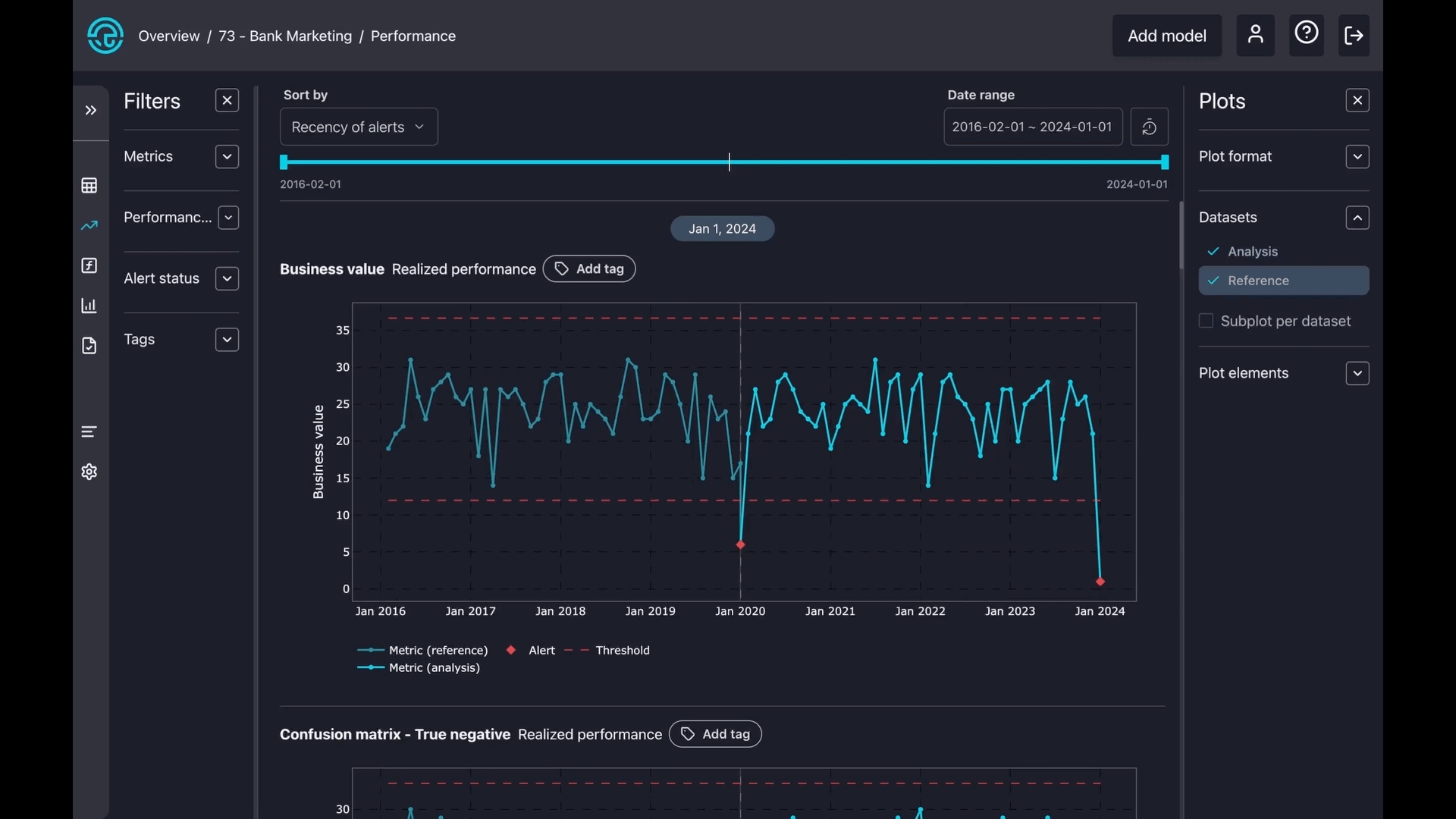
Toggle on or off some components on the charts, like alerts, confidence bands, thresholds, and legends.
