NannyML Cloud
HomeBlogNannyML OSS Docs
v0.24.3
v0.24.3
  • ☂️Introduction
  • Model Monitoring
    • Quickstart
    • Data Preparation
      • How to get data ready for NannyML
    • Tutorials
      • Monitoring a tabular data model
      • Monitoring with segmentation
      • Monitoring a text classification model
      • Monitoring a computer vision model
    • How it works
      • Probabilistic Adaptive Performance Estimation (PAPE)
      • Reverse Concept Drift (RCD)
    • Custom Metrics
      • Creating Custom Metrics
        • Writing Functions for Binary Classification
        • Writing Functions for Multiclass Classification
        • Writing Functions for Regression
        • Handling Missing Values
        • Advanced Tutorial: Creating a MTBF Custom Metric
      • Adding a Custom Metric through NannyML SDK
    • Reporting
      • Creating a new report
      • Report structure
      • Exporting a report
      • Managing reports
      • Report template
      • Add to report feature
  • Product tour
    • Navigation
    • Adding a model
    • Model overview
    • Deleting a model
    • Model side panel
      • Summary
      • Performance
      • Concept drift
      • Covariate shift
      • Data quality
      • Logs
      • Model settings
        • General
        • Data
        • Performance settings
        • Concept Drift settings
        • Covariate Shift settings
        • Descriptive Statistics settings
        • Data Quality settings
    • Account settings
  • Deployment
    • Azure
      • Azure Managed Application
        • Finding the URL to access managed NannyML Cloud
        • Enabling access to storage
      • Azure Software-as-a-Service (SaaS)
    • AWS
      • AMI with CFT
        • Architecture
      • EKS
        • Quick start cluster setup
      • S3 Access
    • Application setup
      • Authentication
      • Notifications
      • Webhooks
      • Permissions
  • NannyML Cloud SDK
    • Getting Started
    • Example
      • Authentication & loading data
      • Setting up the model schema
      • Creating the monitoring model
      • Customizing the monitoring model settings
      • Setting up continuous monitoring
      • Add delayed ground truth (optional)
    • API Reference
  • Probabilistic Model Evaluation
    • Introduction
    • Tutorials
      • Evaluating a binary classification model
      • Data Preparation
    • How it works
      • HDI+ROPE (with minimum precision)
      • Getting Probability Distribution of a Performance Metric with targets
      • Getting Probability Distribution of Performance Metric without targets
      • Getting Probability Distribution of Performance Metric when some observations have labels
      • Defaults for ROPE and estimation precision
  • Experiments Module
    • Introduction
    • Tutorials
      • Running an A/B test
      • Data Preparation
    • How it works
      • Getting probability distribution of the difference of binary downstream metrics
  • miscellaneous
    • Engineering
    • Usage logging in NannyNL
    • Versions
      • Version 0.24.3
      • Version 0.24.2
      • Version 0.24.1
      • Version 0.24.0
      • Version 0.23.0
      • Version 0.22.0
      • Version 0.21.0
Powered by GitBook
On this page
  1. Model Monitoring
  2. Reporting

Add to report feature

PreviousReport templateNextNavigation

The user, when checking the model's state on the Monitoring page, can add plots to reports directly from the monitoring page.

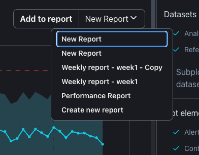
On the top right corner of each plot the user will find the Add to report button and the most recent report selected. Clicking on Add to report button will add the plot to the selected report. The user may select the desired report by clicking on the report name. The user can even create a new report by selecting the Create new report option.

Clicking on Add to report button will add the plot to the end of the selected report. After adding plots to a report, it is important to go to the report to re-position the plots and add relevan information to them.

Plot date range and style

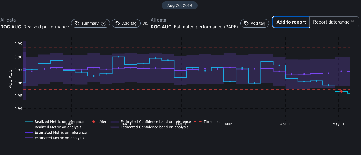
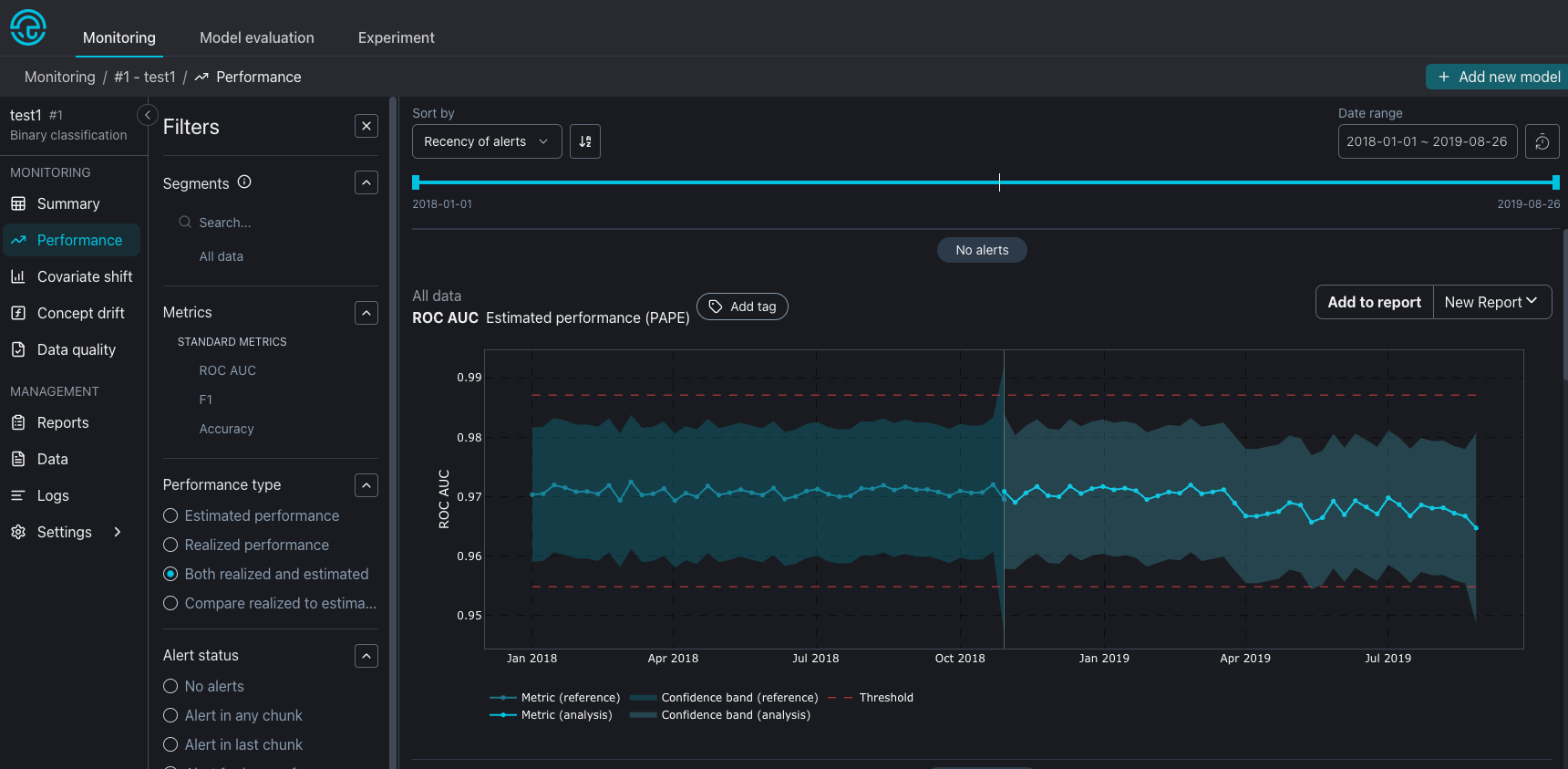
When adding a plot to a report, the current state and configuration of the plot will be kept. This means if the user selects a plot with some specific setup like comparing realized and estimated performance during an specific date range, the same plot style will be kept on the report.

After clicking on Add to report button, a toast will inform the user that the plot was added to the selected report.

Adding a plot to a report with date range

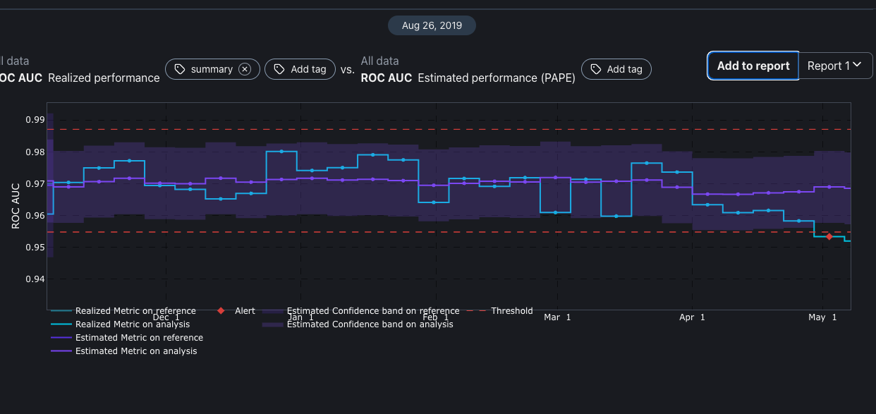
If the selected report is composed of all data, the Added plot will keep its selected date range, as in the previous example. But if you add a plot to a report with a selected date range. The plot will follow first the report date range, second the original plot date range. This means that only the overlapping date range will be displayed.

If there is no overlap between the plot and report, the plot will be empty.

Plot on Performance Monitoring dashboard
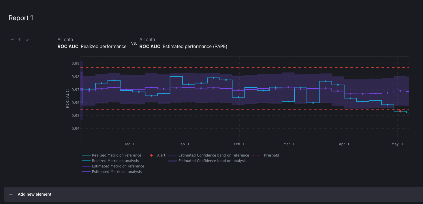
The same plot added to the Report 1
Original plot ranges from Dec 2018 to May 2019
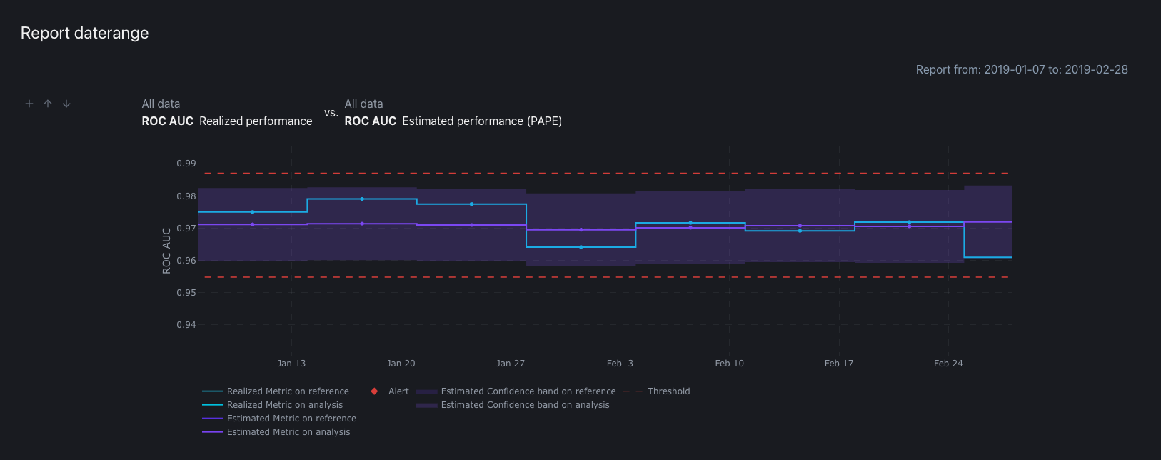
When added to a report with a date range, just the overlap is displayed
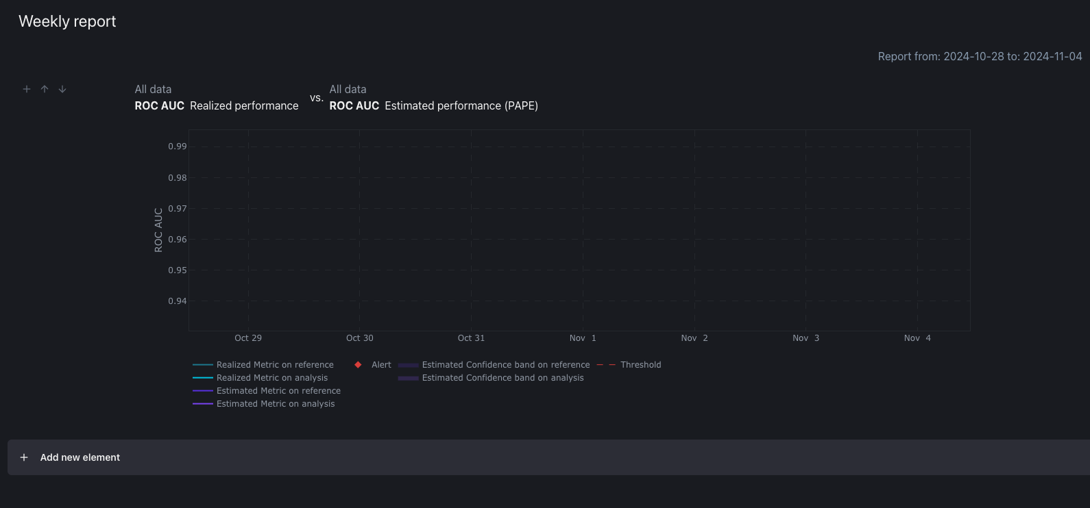
The plot data ended on May 2019, adding it to a weekly report (Oct 2024) displays no data.